Full of Langhe

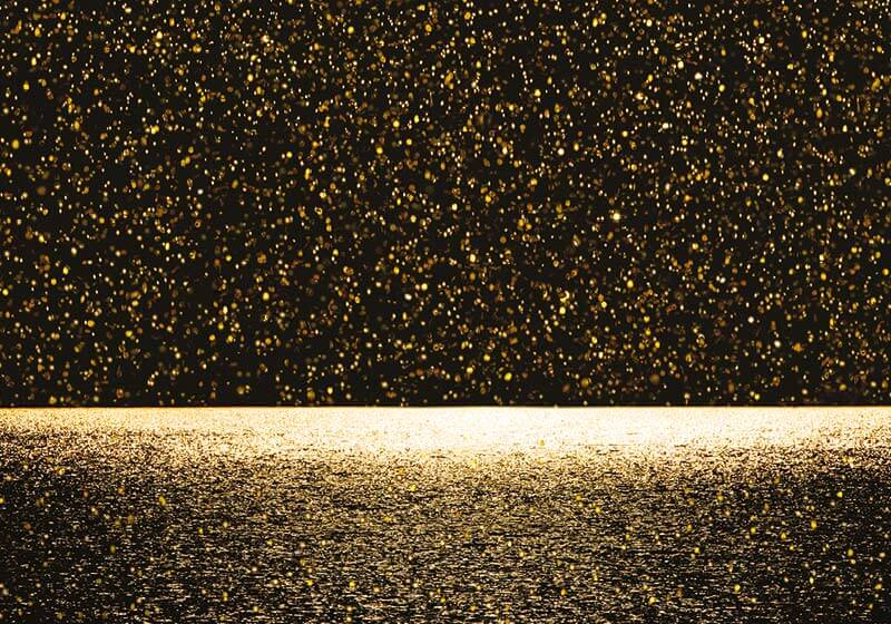
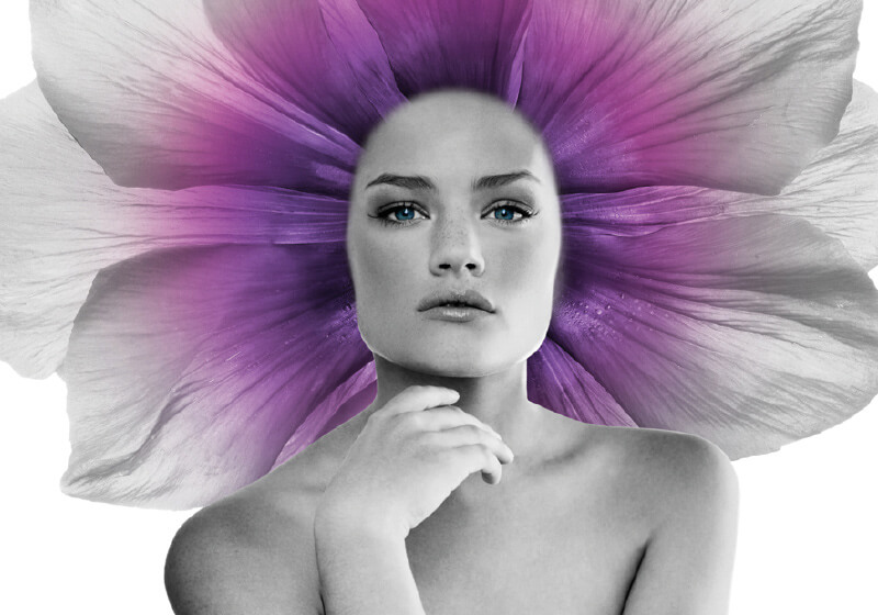
È la sintesi concettuale, strategica e creativa del lavoro che Dolci Advertising ha sviluppato per Barò, azienda che nel mercato della cosmesi si distingue per cura delle materie prime, autenticità e forza innovatrice, oltre a una forte connessione con il territorio delle Langhe e del Barolo, da sempre terreno fertile, ricco di eccellenze e in grado di raccontarsi con sincerità.

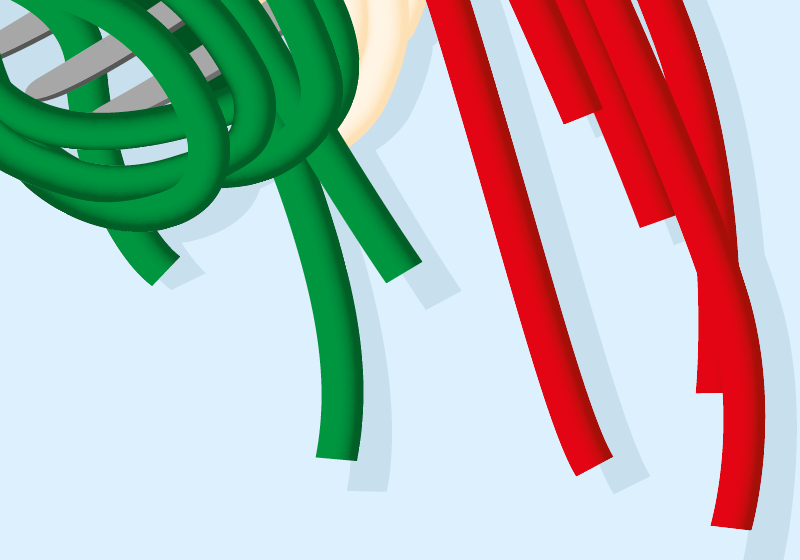
Questo concetto prende vita nella creazione della nuova visual identity e nel restyling del logo di Barò, che abbiamo realizzato scegliendo il motivo delle lingue di terra, metafora di sviluppo e dinamicità, a cui abbiamo accostato i colori più rappresentativi delle Langhe e dei valori del brand, adattandoli al mondo della skincare.

Dal manifesto al payoff di marca, celebriamo la genuinità e l’unicità delle Langhe attraverso tutti i materiali di campagna.

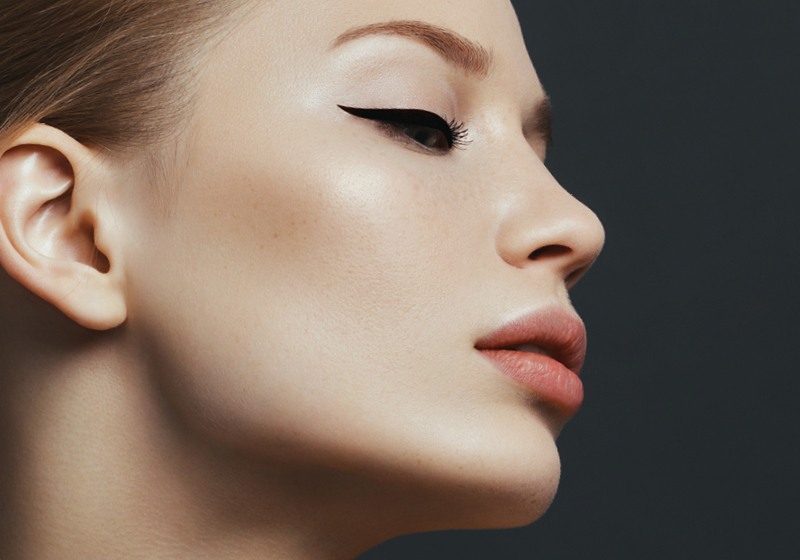
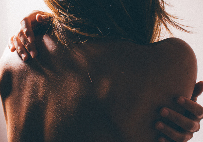
Un unico, grande, filo conduttore: esaltare il valore della bellezza più autentica, quella naturale.

Prefolic mamma – Fin dal sogno di diventare mamma

Prefolic Mamma è un mondo che dà cura e sostegno a tutte le donne che sognano di diventare mamma. È per questo che quella che raccontiamo è proprio la storia di un sogno. Un sogno che apre una finestra sul futuro di una donna. Il momento in cui scopre di essere incinta, l’indimenticabile giorno del parto, i primi passi del suo bambino, la costruzione, giorno dopo giorno, di una famiglia piena d’amore. Scene di vita quotidiana estremamente personali e uniche, ma così autentiche da essere universali.

“Questo non è un sogno come tanti, ma uno di quelli che spero diventi realtà. Perché mio figlio è con me, fin dal sogno di diventare mamma”. Queste le parole della donna quando scopre che tutto quello che ha appena visto, per il momento, è ancora racchiuso in una dimensione onirica. Ma ciò non la scoraggia. In una storia dove sogno e realtà si incontrano per scrivere il futuro, si accende in lei una rinnovata consapevolezza.

Armani Values

Giorgio Armani ha creato uno stile che va ben oltre alla moda. È uno stile di vita. Un modo di essere e di porgersi, fatto certamente di abiti e accessori, ma anche di modi, gesti, attenzioni, relazioni e responsabilità. Sono tutti valori che sanno essere forti e radicati, ma che allo stesso tempo rappresentano un’espressione libera e personale, pregna di quell’autenticità che fa di Armani una storia universale. Quella che raccontiamo è infatti una storia che riguarda noi e il nostro pianeta. La storia di un ago e di un filo che cuciono insieme persone diverse, dando vita a un mondo sempre più inclusivo e sostenibile.  Creata nel massimo rispetto del minimalismo stilistico di Armani e ricostruita utilizzando i disegni, i cartamodelli e le fotografie dello stilista, questa storia è una celebrazione. Non della moda, ma dell’uomo. O meglio dell’essere umano come fusione di codici maschili e femminili che raccontano una femminilità misteriosa e personale e una mascolinità morbida e consapevole. Una storia dove etica ed estetica si incontrano per disegnare un nuovo futuro possibile.

Tokyo 2020. Warriors own 7 virtues

Come si vince la gara per la più importante casa di moda italiana che veste l’evento più grande del globo?

Cercavamo l’ispirazione inseguendo immagini sofisticate e parole emozionanti, ma abbiamo trovato un numero. Un numero che rappresenta l’alchimia perfetta di tutto quello che volevamo raccontare: Il Giappone, le Olimpiadi, Armani. Il Bushido giapponese, che letteralmente significa La Via del Guerriero, ci racconta che 7 sono le virtù che deve avere un guerriero per vincere la sua sfida. Una sfida che si gioca prima di tutto su un piano etico e morale. Con questa campagna worldwide tv (30″ e 15″) e social ideata da Dolci Adv, EA7 diventa ambasciatore delle 7 virtù del guerriero, vestendo gli atleti della Nazionale e avvicinando l’Italia al Paese del Sol Levante.

Different eyes, different lives

The eyes with which you look at the world define your place in the world.
In this campaign – which showed a series of characters making life choices that were unorthodox, original, outside the box – the theme of a different perspective is paramount.
A new, fresh, original look at life. A look called “Frames of Life” by Armani.
A 2-minute teaser video presenting the characters, 5 films telling the stories of these characters from different parts of the world, press adverts and billboard posters, including the iconic mega-billboard in Milan’s Via Broletto.

Stop and see

A project arising from a collaboration between Giorgio Armani and leading international film schools, to promote and support the work of young, emerging filmmakers.
In the press campaign, a sequence of single and double pages and billboards, we wanted to highlight this cinematic approach with a treatment inspired by movie posters and using language typical of the cinema, distilling the storytelling power of the short films by these young directors.

Who is Fred?

 È proprio dalle domande che, a volte, nascono le idee. Ed è questa la domanda da cui noi di Dolci siamo ripartiti per raccontare chi è davvero Fred Mello. Chi è Fred? Ce lo siamo chiesto noi, ma soprattutto lo abbiamo chiesto alle persone con un obiettivo preciso: creare awareness e memorabilità per questo brand italiano dall’animo newyorkese.

Così è nata la nuova campagna integrata Fred Mello, valorizzata da un brano musicale originale e sostenuta da una pianificazione media che coinvolge TV e digital. 

Una domanda che si è trasformata creativamente in una moltitudine di risposte. Perché Fred non ha una sola voce né un solo volto, ma rappresenta chiunque desideri esprimere se stesso nel proprio modo di vestire. Un brand in cui ognuno può identificarsi, trovando lo stile che più lo rappresenta. Il risultato è un progetto costruito passo a passo con il cliente, dai focus group alla campagna on air, per dare vita a un linguaggio di comunicazione semplice, ma allo stesso tempo unico e distintivo. 

Stannah. Ti cambia la vita

Trasparenza, fiducia, credibilità. Ecco i valori sacri della pubblicità, oggi sempre più difficili da comunicare. La nuova campagna integrata del leader dei montascale Stannah li esprime al meglio, rendendoli portavoce del main concept del brand “Ti cambia la vita”.

Una campagna che nasce in Dolci da un’evidenza: su Trustpilot, una delle piattaforme di recensioni più accreditate a livello internazionale, Stannah è valutata 4,8 stelle su 5 grazie alle autentiche testimonianze di tutti coloro che hanno ritrovato la loro libertà di movimento. “Se hai cambiato vita, si vede”. Sì, perché chi ha cambiato vita con Stannah brilla nella sua totalità e la sua soddisfazione è come una stella che lo accompagna in qualsiasi momento. E vuole dirlo a tutti, condividendo la sua esperienza positiva.

È proprio nel claim “dillo a tutti” che si innesca il meccanismo di raccomandabilità, ancora oggi la migliore forma di comunicazione per un’azienda.

Anticipata da una fase teaser, la campagna ha dimostrato di avere tutte le potenzialità per dare vita a un piano di comunicazione integrata davvero completo. Una strategia precisa che, partendo dalla campagna TV, si sviluppa attraverso stampa, digital e social dando forma a una comunicazione in grado di auto-alimentarsi grazie a recensioni sempre  nuove.

Scarpe & Un mondo da scoprire

Scarpe&Scarpe è uno di quei brand dal nome inequivocabilmente, e doppiamente chiaro.

Ma la comunicazione non si accontenta della chiarezza. Dietro a questo nome, e soprattutto dietro alla sua &, c’è un mondo da scoprire e da svelare. Ed è proprio da qui che nasce la strategia di comunicazione 2023, che ha l’obiettivo di riaff ermare il ruolo della marca, riportando al centro le persone e il punto vendita. Una campagna di comunicazione integrata, che partendo dal nome racconta le infi nite possibilità che si nascondono tra un paio di sneaker e un tacco 12.

Perché un paio di scarpe non è mai solo un paio di scarpe: per alcuni è una scelta intelligente, per altri un desiderio mai svelato, per altri ancora una gran voglia di raccontarsi al mondo. Scarpe & Divertimento, Scarpe & Famiglia, Scarpe & Saldi, Scarpe & … nella campagna nazionale del circuito delle grandi stazioni, sui social e nei punti vendita la & diventa il perno della comunicazione. Un simbolo iconico e distintivo che viene valorizzato per comunicare una consumer experience versatile e sorprendente, con un ventaglio di possibilità per tutte le occasioni.

Una giornata in ufficio & una festa con le amiche, una gita fuori porta & un weekend di totale relax… perché scegliere quando si può avere tutto?

La pasqua delle meraviglie

A volte basta sbirciare da una piccola fessura, oppure sollevare appena un coperchio, per scoprire un mondo magico fatto di incontri inaspettati e combinazioni sublimi.

“Eat me” è un invito che contiene un incantesimo, perché la Pasqua Leone si mangia anche con gli occhi e con il cuore. Ispirandosi alla storia senza tempo di Alice nel Paese delle Meraviglie, i personaggi della Pasqua Leone ci invitano a seguirli nel loro immaginifico mondo: uno specchio che riflette l’altra parte di noi. Quella più imprevedibile, colorata e travolgente, dove a comandare sono l’istinto e la fantasia.

Sartoria senza confini

Portare avanti il filo di un nuovo discorso. Questo l’obiettivo della collaborazione tra l’agenzia e Colori Vivi, sartoria sociale che aiuta le donne in difficoltà insegnando loro il mestiere della sarta.
Inutile dire che in un’agenzia fatta prevalentemente di donne questo progetto è stato subito accolto con grande entusiasmo, dedizione ed empatia. Dopo aver visitato diverse volte lo showroom e aver parlato con tutte le sarte, l’agenzia ha ideato un nuovo posizionamento espresso al meglio dal suo payoff: Sartoria senza confini. Perché abbattere ogni barriera e tessere la trama di un racconto fatto di solidarietà disinteressata è un viaggio da fare insieme, per arrivare sempre più lontano e sempre più in alto. Ed è proprio questo, UP, il concetto che è stato associato alla nuova Collezione Autunno-Inverno 22/23, per la quale è stato sviluppato un piano editoriale per presentare i nuovi capi su Instagram.
UP perché Colori vivi si è fatto promotore di una moda Upcycled, nata da deadstock pregiati provenienti da case d’alta moda, Upgraded, curata nei minimi dettagli, ma, soprattutto UP to YOU. Per portare avanti il filo di un nuovo discorso c’è bisogno, infatti, di tutti quelli che scelgono una moda etica e consapevole. Di chi la disegna, di chi la comunica e di chi la indossa.

Insieme per la salute di tutti

Insieme per la salute di tutti. È proprio questa la mission di Cluster lombardo, espressa creativamente in un nuovo posizionamento, riscritto dall’agenzia.

Una sfida accolta con grande determinazione, quella necessaria a raccontare tutto il valore della comunità di Regione Lombardia che riunisce le realtà pubbliche e private con un obiettivo condiviso: migliorare la vita dei cittadini. Ecco come condivisione, comunità e vicinanza si rivelano essere concetti imprescindibili per innovare le scienze della vita, ma anche per ispirare un nuovo key visual, identificato nel simbolo di un abbraccio.

Una rinnovata identità visiva in grado di delineare passo dopo passo un vero e proprio progetto di comunicazione integrata, declinata su canali tradizionali e digital: dalla stationery alla brochure istituzionale, dalla newsletter alla consulenza social (LinkedIn e Twitter), fino al video istituzionale e al sito web.

Back to my nature

A volte la sfida del nostro lavoro non è inventare una nuova identità di brand, ma riportarla alla luce. Questo è il caso di Lisanza.

Un nome che da 100 anni sceglie di vestire le donne solo con Intimo e Maglieria di altissima qualità.  Nonostante i drastici cambiamenti del mercato e  l’avvento del “Fast-Wearing”, Lisanza non ha mai rinunciato ai valori della tradizione e all’eccellenza del Made in Italy. 

Lisanza è sempre stato uno di quei brand che dimostra tanto, ma parla poco, sfruttando il passaparola più che una vera strategia di comunicazione. Oggi, grazie a un progetto di immagine coordinata che prevede una nuova coerenza visiva e concettuale in tutte le sue parti, dal logo al packaging, dalle etichette agli shopper, dall’immagine istituzionale ai cataloghi per la forza vendita, l’agenzia ha restituito a Lisanza la sua unicità. Proprio come il payoff di campagna “Back to my Nature” ha voluto restituire alla donna la sua più vera e intima essenza. Tradizione e ricerca si intrecciano nel sottobosco di una natura italiana ricca e selvaggia, ma al tempo stesso segreta e discreta, per celebrare una femminilità senza tempo.

Una donna libera e spontanea, lontana dalle mode e in perfetta armonia con il proprio essere.

Let’s build a story together

Dedicato a chi pensa in grande.
Il viaggio di brand identity, strategia e comunicazione che Aran Contract ha intrapreso insieme a noi.

L’ambizione di superare sé stessi, lo sguardo oltre l’orizzonte, lo spirito cosmopolita e internazionale, il Made in Italy a misura di mondo. Questa è la nuova voce che abbiamo dato ad Aran Contract, la divisione business di Aran che arreda i grattacieli, gli uffici e gli alberghi più importanti di tutto il mondo e che oggi è in grado di parlare con i general contractor, i developer e i più grandi studi di architettura posizionandosi come una vera e propria marca.
La costruzione della nuova identità di Aran Contract, solida e distintiva, è avvenuta grazie a un lavoro di strategia e comunicazione che abbiamo studiato e ideato a 4 mani con il cliente, seguendolo passo a passo e guidandolo in ogni fase del progetto.
“Let’s build a story together” è il titolo di questo viaggio. Il viaggio che Aran Contract intraprende ogni giorno con i suoi prestigiosi committenti internazionali, offrendo loro tutti i migliori strumenti per garantire la massima professionalità, cura e dedizione.
Ed è il viaggio che noi ed Aran stiamo facendo insieme, per trasformare una forte Business Unit in una marca altrettanto forte.

Senza pensieri

Senza pensieri. È così che Stannah Italia vuole far stare i suoi clienti, dando loro l’opportunità di usufruire, in seguito al rinnovo della legge di bilancio 2023, dello sconto del 75% direttamente in fattura. L’agenzia ha raccontato con entusiasmo e dedizione l’esistenza di questa possibilità, convinta del fatto che grazie a essa milioni di italiani con limitata libertà di movimento potranno davvero cambiare in meglio la loro vita. Ed è proprio il cambiamento di vita, in pieno stile Stannah, ad essere ancora una volta il protagonista della campagna di comunicazione.

“Quando cerchi un montascale, non cercare un montascale. Cerca Stannah, quello che ti cambierà la vita”. Così recita infatti lo spot tv realizzato per l’occasione, che nel visual richiama il meccanismo della barra di ricerca di un browser. Le uscite stampa e l’attivazione di una strategia digital a tutto tondo completano la campagna.

Prefolic Ferro

Per Prefolic Ferro, integratore prodotto dalla casa farmaceutica Zambon, l’Agenzia ha curato il progetto in ogni passaggio: dal design del packaging, payoff, alla realizzazione di dischi vendita, fino a tutti i materiali comunicativi per studi medici e farmacie.

La scelta del rosso per rappresentare la forza e la valorizzazione visiva dei tre strati, elemento distintivo del prodotto con uno studio del logo cucito sullo stile della famiglia degli integratori Prefolic.

Prefolic Mamma

Per Prefolic Mamma, integratore prodotto dalla casa farmaceutica Zambon, l’Agenzia ha curato il progetto in ogni passaggio: dal design del packaging, payoff, alla realizzazione di newsletter, dischi vendita, fino a tutti i materiali comunicativi per studi medici e farmacie.

Un’atmosfera tenera, un bambino appisolato su una nuvola mentre viene portato da una cicogna come simbolo della cura e del sostegno che Prefolic Mamma da a tutte le donne che ne hanno bisogno.

La grande famiglia dei compressori d’aria

Per FNA, gruppo multinazionale con oltre 70 anni di esperienza nel settore dell’aria compressa, l’agenzia ha seguito e lavorato alla brand identity, al restyling del logo e del sito e all’ideazione del nuovo payoff. Tutto nasce da qui, “The great family of air compressors”, che racchiude in sé tutto il lavoro di rebranding della marca. Da qui nascono anche la campagna stampa e il video istituzionale che, in modo semplice e innovativo, riescono a trasmettere i valori di un’azienda familiare dall’aria multinazionale.

Un altro mondo che ha a cuore il mondo

Sfruttando l’occasione degli auguri di Natale ai propri soci e ai propri fan, Altroconsumo ha deciso di realizzare un video istituzionale in cui raccontare la sua mission e i suoi ideali.

Il video mostra in modo metaforico i valori di Altroconsumo rappresentati attraverso illustrazioni in bianco e nero semplici, fresche e immediate.

Il voice over racconta in maniera empatica e vicina la missione del brand mentre le immagini scorrono davanti a noi.

Il video riesce inoltre a coinvolgere lo spettatore facendolo entrare in un nuovo mondo, facendo in modo che si senta parte di un universo fatto di persone, di esperienza e di storia.

Il lato buono del sano

Per Bem, un mondo di barrette bio, vegane e senza glutine, l’agenzia ha seguito e lavorato alla brand identity, alla creazione del packaging e all’ideazione del payoff.

Colori, ironia e healthy food sono le parole d’ordine per la comunicazione di questo nuovo universo bio. Le pagine Facebook e Instagram che seguiamo quotidianamente si basano proprio su questi principi: usando un tono di voce leggero e ironico, vogliono informare il target su quanto sia importante mangiare in modo sano, ma su quanto possa essere anche buono il cibo sano, il tutto senza perdere la leggerezza, i colori e la simpatia ormai tipici del DNA di Bem.

Due esperienze uniche a portata di tutti

La Certosa di Avigliana e l’Oasi di Cavoretto sono due strutture ricettive uniche nel loro genere. Uniche perché sono gestite dal Gruppo Abele, onlus-ong nata a Torino nel 1965 e fondata da don Luigi Ciotti. Uniche perché racchiudono i servizi tipici dell’hôtellerie in due location pure dove ogni cosa è pensata per fare del bene.

Per raccontare tutto questo, l’Agenzia ha analizzato il loro posizionamento e lo ha sviluppato in uno storytelling mirato, esplorando un percorso preciso e definito: un nuovo modo di intendere la sosta, il viaggio, il soggiorno fuori dalla propria casa e trasformato in esperienza di riconciliazione con la propria parte più pura.

Nel caso dell’Oasi di Cavoretto, questo percorso è sfociato nella definizione di un nuovo payoff, vivi la semplicittà, che contribuisce all’identificazione di una nuova categoria nel campo delle strutture ricettive.

Il progetto ha riguardato in pari misura anche il restyling dei loghi, adesso più contemporanei, e la realizzazione di tre brochure istituzionali: una per la Certosa di Avigliana, una per l’Oasi di Cavoretto e la terza onnicomprensiva dedicata alla clientela business.

Questi materiali costituiscono il format per la nuova comunicazione delle due strutture: i loro contenuti rappresentano infatti elementi, come la segnaletica dei diversi ambienti e dei servizi, che ne rafforzano l’identity.

Lo sai che in ogni guida trovi tutto quello che devi sapere?

Le guide InPratica di Altroconsumo sono tutto quello che serve per conoscere ogni cosa su qualsiasi argomento. Dal giardinaggio alla schiscetta perfetta, ogni guida contiene tutte le risposte alle domande che ci facciamo quotidianamente.

La nuova comunicazione delle campagne stampa è incentrata su un gioco copy semplice e intuitivo, accompagnato da colori freschi e da giocose illustrazioni.

L’escamotage del doppio titolo vuole arrivare in maniera diretta e immediata al cuore del consumatore, comunicando sia in modo generico l’obiettivo di Altroconsumo, sia in modo più specifico il fine ultimo della guida.

Let’s walk together

Non faremo mai più una campagna come questa, perché non ne avremo più bisogno.

È quello che vorremmo poter dire a tutte le donne. Si crede che la pubblicità sia solo un mezzo utilizzato dalle aziende per convincere il mondo a continuare a comprare. Ma in realtà la comunicazione pubblicitaria è molto più di questo, è sensibilità, intuizione, creatività e spesso saper usare parole semplici per raccontare ideali infiniti.

È il caso di questa campagna, realizzata in un momento difficile per tutti, dove la volontà del cliente era quella di fare un passo verso un mondo migliore e libero dalla violenza. Abbiamo cercato di utilizzare la forte identità di Scarpe&Scarpe come insight per sostenere Telefono Rosa, associazione che da anni si batte a sostegno della causa. La campagna si è sviluppata attraverso la produzione di una shopper edizione limitata venduta in negozi selezionati e con una comunicazione social che puntava a generare awarness nel pubblico spingendo gli utenti a ripostare il manifesto. Let’s walk togheter to end violence against women, non è quindi solo un claim ma è l’esempio di come la pubblicità possa trasformare un brand che vende calzature in un brand che lotta per un mondo migliore, e non solo per un giorno ma per sempre.

Primo e Caredent rispondono prontamente al mercato. Anche in questo momento di dubbi e incertezze

Primo e Caredent rispondono alle domande dei loro clienti con 140 centri al servizio del sorriso, noi rispondiamo alle richieste dei nostri con innovazione e creatività. Siamo partiti da un brief con tanti paletti, sia per tutti quei “non si può dire” che impone la nuova regolamentazione sulla comunicazione dentistica, sia per tutti quei “non si può fare” dettati invece dal lockdown.

Non potendo “girare”, né a piedi né tanto meno con una steadycam, abbiamo scelto di percorrere un’altra strada: l’animazione grafica. Motion graphics, illustrazione e typography rappresentano un universo molto fertile e ancora tutto da inventare, ricco di sperimentazione e di possibili esplorazioni creative. In questa campagna tv, sviluppata in collaborazione con la casa di produzione inglese Nucco Brain e declinata poi anche su  stampa, affissione, radio, materiali btl e web, abbiamo dato vita a un linguaggio creativo semplice ma efficace, capace di farsi notare in pubblicità perché ancora poco utilizzato. In fondo, questo lavoro ci conferma che fare creatività significa prima di tutto saper trasformare i limiti in nuove opportunità di comunicazione.

Scarpe&Scarpe, my way

“Dimmi che scarpe indossi e ti dirò chi sei”. La campagna AI 20/21 di Scarpe&Scarpe esprime la perfetta sintesi tra prodotti e persone: ogni tipologia di cliente può riconoscersi nel look che più gli assomiglia.

Il prodotto, sempre indossato, è ritratto in un contesto caldo, moderno e mai scontato, mentre la rinnovata collaborazione con la testimonial Cristina Chiabotto aggiunge valore e notorietà agli scatti per la collezione donna. Dalla campagna online e offline ai progetti di loyalty e promotion, dalle affissioni ai comunicati  radio, la comunicazione di Scarpe&Scarpe ha sempre un mood fresco e glam e un tono di voce leggero e contemporaneo.

Know, save, grow

Conoscere per risparmiare, conoscere per crescere. E’ il nucleo concettuale, strategico e creativo del lavoro che Dolci Advertising ha sviluppato per GESCO, dinamica Energy Service Company che si muove in un mercato ricco, competitivo e in grande fermento.

L’esecuzione di questo concetto si appoggia su una simbologia semplice e potente, una pianta rigogliosa e maestosa, che abbiamo eletto a key visual del brand, protagonista del video istituzionale che utilizza la metafora per raccontare l’azienda a partire dalla trasformazione di un seme nella pianta di GESCO.

La metafora della crescita vive in modo coeso e coerente anche in tutti gli altri materiali realizzati, dall’annuncio stampa ai materiali commerciali come company profile e brochure di prodotto per i servizi relativi ad impianti fotovoltaici e di cogenerazione.

L’ambizione e la mission che abbiamo voluto raccontare sono perfettamente distillate nel titolo della campagna, Coltiviamo l’energia del tuo futuro.

Perché, come recita il testo, “chi semina GESCO, raccoglie energia.”

Storia di Cesarina. La vita oltre l’Alzheimer

Non è facile raccontare l’Alzheimer, ancora più difficile è raccontarlo con verità, sensibilità e affetto. Noi ci abbiamo provato raccontando la storia di Cesarina.

Lo sguardo dall’interno che offre Anni Azzurri su tematiche così complesse e controverse offre a tutti noi un momento di riflessione, il concetto “Benvenuti a casa” lanciato lo scorso anno con una campagna integrata, invita tutti quelli che ancora non la conoscono ad entrare in questa grande casa in cui c’è spazio per tutti anche, o forse soprattutto, per Cesarina e per la sua famiglia.

Per questo è stato scelto di girare con persone reali che raccontano storie semplici e autentiche, fatte di piccoli gesti quotidiani e di nuovo stupore per le piccole cose.

Una sensibilità che hanno i bambini, che spesso sparisce con l’età adulta e poi ritorna nella terza età. Perché “gli anziani sono quelli che non dovendo più rincorrere il futuro, possono permettersi di vivere pienamente il loro presente.” E noi ci auguriamo che questo progetto di comunicazione sia servito prima di tutto a loro, gli ospiti, per sentirsi ancora coinvolti e protagonisti di questa avvincente avventura che è la vita.

Il video è stato realizzato prima del DPCM del 4 Marzo 2020, per questo i soggetti ritratti non indossano dispositivi di protezione.

La pianificazione del video è iniziata lunedì 21 settembre proprio in occasione della giornata mondiale per l’Alzheimer.

Stannah. Ti cambia la vita

In un periodo in cui parlare di libertà sarebbe stato un paradosso Stannah, la cui promessa è sempre stata “ritrova la gioia di muoverti liberamente”, ha cercato di entrare nelle case delle persone, senza retorica né sentimentalismi, ma con una consapevolezza del presente.

Ha cercato di adattare la nuova comunicazione a un momento molto delicato aggiungendo nuovi soggetti agli spot attualmente in onda e alle campagne stampa.

Fare una videochiamata con i propri nipoti o uscire di casa più volte al giorno col proprio cane sono le azioni che hanno sempre fatto parte del nostro quotidiano ma che, in questo periodo, ci sono servite per riscoprire un nuovo senso di libertà.

Domitys Quarto Verde. Un modo più sicuro di vivere la terza età

Bergamo, il lockdown e un nuovo concetto abitativo per la terza età, diverso da tutti gli altri e in grado di dare, in un momento così difficile, una risposta concreta alle esigenze dei senior e della città. È così che nasce la nuova campagna Domitys Quarto Verde: unendo i puntini per creare un nuovo disegno, utile a tutta la comunità. Ai senior, per sentirsi più sicuri senza dover rinunciare alla propria libertà, e ai loro cari, per non doversi preoccupare di saperli in giro o, peggio, soli con il pericolo del Coronavirus.

La nuova soluzione abitativa Domitys Quarto Verde rappresenta davvero un modo più sicuro di vivere la terza età. Senza perdere la propria indipendenza, la propria voglia di rimanere attivi e la sensazione di protezione che solo una casa sa trasmettere.

La campagna è andata on air su stampa locale, affissioni intorno all’ospedale Papa Giovanni XXIII, radio e banner web.

Anni Azzurri. Uno sguardo dall’interno

Questo è stato un periodo particolare, un periodo in cui Anni Azzurri ha dovuto, per il bene e la sicurezza degli ospiti, chiudere al pubblico. Anni Azzurri ha però deciso di far entrare le persone in un altro modo, ha aperto le sue strutture, sia quelle contaminate dal virus sia quelle covid free, all’occhio di un fotografo che, con il mezzo del reportage, è riuscito a documentare con uno sguardo autentico, con uno sguardo dall’interno un periodo molto delicato. Stanchezza, fatica, impegno ma anche sorrisi e vicinanza, sono le sensazioni che è stato in grado di raccontare e di trasmetterci. 

Lo strano caso di Nelson Whitman

David, Rashid, Karen, Pauline, John e Giulia sono i sei protagonisti “ottenni” del nuovo libro dedicato ai bambini di Marco David Benadì: “Lo Strano caso di Nelson Whitman” un progetto sociale, un Artbook, un racconto, una sceneggiatura, un videotrailer, un incrocio di tutto questo.

Sei storie di bambini totalmente diversi l’uno dall’altro, raccontate attraverso le immagini di Sonia QQ, nome d’arte dell’illustratrice Sonia Cuculelli. Sei personaggi che condividono avventure e disavventure, sei storie che parlano di intolleranza e accoglienza, di inclusione e emarginazione, sei storie in cui il Canarino Nelson, pensatore pennuto, maestro e compagno, amico dei bambini, svolge il ruolo di fonte d’ispirazione e fil rouge del progetto.

Raccontato in anteprima il 24 novembre presso il Polo del 900’ di Torino “Lo strano caso di Nelson Whitman” verrà presentato ufficialmente a Palazzo Bilotti a Roma il 12 dicembre in occasione della mostra a cura di Ermanno Tedeschi “Unforgettable Childhood”, l’infanzia indimenticabile.

Il ricavato della vendita dei libri sarà interamente devoluto a sostegno di Casa Ugi Onlus, l’Associazione che riunisce i genitori italiani con piccoli affetti da tumore che da sempre si occupa di migliorare la qualità della vita dei bambini e ragazzi nel corso della terapia e aiutare le famiglie ad affrontare le difficoltà.


Per ordinare una copia del libro:

Presso Casa Ugi Corso Unità d’Italia, 70 Torino

Vai sul sito www.ugi-torino.it

Chiama il numero 011 664 9400

Scrivi a casa@ugi-torino.it

Per informazioni

www.iosononelson.it

https://www.ugi-torino.it


Playmaker Collection by Peppe Poeta

Peppe Poeta, giocatore della nazionale italiana di basket e capitano di Reale Mutua Basket Torino, ha firmato per Scarpe&Scarpe una capsule collection dedicata agli uomini che vogliono diventare icone, modelli da seguire rimanendo sempre fedeli a se stessi. Il playmaker di una squadra è infatti chi decide le giocate, il perno attorno al quale ruotano le azioni, la star.

L’Agenzia ha realizzato un ampio progetto che ha riguardato: naming della collezione, logo design, in store communication, in store e web activities.

Home care human cure

Sapio Life, parte del Gruppo Sapio, è uno dei principali protagonisti nell’ambito dei servizi ospedalieri e dell’assistenza domiciliare.
Sapio sa quanto ogni specialista considera importante la relazione umana con i propri pazienti, oltre alla fornitura di dispositivi all’avanguardia, si impegna costantemente a formare professionisti altamente specializzati non solo nella somministrazione delle terapie prescritte, ma all’ascolto  delle emozioni dei pazienti e dei loro care giver. 
Per questo l’Agenzia ha proposto di dare a questa forte vocazione un’immagine e un claim di immediata comprensione. L’immagine si esprime in un key visual dove una persona è avvolta, circondata da mani accudenti. Home care, Human cure riassume la missione.
Nel video, la promessa è sostenuta dai valori di Sapio life, e da tutti i suoi numerosi servizi.

Campanelle

Giocosa e anticonformista, proprio come la collezione: nel concept creato dall’Agenzia, la brochure Campanelle riflette l’essenza del gioiello icona della Maison Chantecler con sapienti accostamenti di illustrazioni d’autore e cornici in maiolica.
Tutte le Campanelle più iconiche sono glorificate, sospese nel cielo turchese di Capri.

Alta gioielleria

Capri, l’isola in cui il mare sfuma le linee tra il qui e l’ora, la Dolce Vita diventa vita quotidiana e idee visionarie si trasformano in gioielli.
Il concept creativo alla base della brochure Alta Gioielleria è la celebrazione congiunta della bellezza dell’isola di Capri e dei capolavori Chantecler. Il cielo, il mare, i colori e la Natura lussureggiante caprese fanno da cornice a collezioni anticonformiste e dal fascino senza tempo.

Rinofluimucil – L’incompreso

Quando il raffreddore è forte, il naso si chiude e noi… diventiamo incomprensibili.
Questo accade a un giovane uomo che, recatosi alla reception, non è assolutamente in grado di farsi capire.
Mentre il suo cane si vergogna a vederlo così balbettante, la volonterosa receptionist, sfoggia invano tutte le sue lingue, finché grazie a Rinofluimucil il problema si risolve. E si risolve davvero bene, tanto che lui torna a trovarla con un bel mazzo di fiori.
Ideato per il mercato russo e girato a Mosca, il film va in onda nei formati 20”, 15” e 5”.

Expert care when you need it

Una persona affetta dalla Malattia di Parkinson dispone in media di solo due ore all’anno per confrontarsi con un neurologo specializzato. Il resto del tempo è sola o in compagnia di un familiare ad affrontare sintomi sempre nuovi e diversi.

Per incontrare le esigenze di pazienti, caregiver e neurologi, nasce ParkinsonCare, una piattaforma di teleassistenza infermieristica specialistica per fornire supporto quotidiano e ottimizzare la terapia.

L’Agenzia ha curato il progetto in tutte le sue fasi: dal logo design, ideazione del payoff e immagine coordinata, alla realizzazione della piattaforma mobile e desktop, fino a tutti i materiali comunicativi per studi medici, fiere, convention aziendali (video istituzionale, leaflet, poster).

La magia di Stannah

Nel rivisitare una fiaba classica in chiave moderna abbiamo immaginato i nostri protagonisti, un principe e una principessa, un po’ incanutiti e alle prese con qualche problema nel salire le scale, ma ancora molto innamorati.


Ecco allora arrivare la magia di Stannah, per restituire loro la gioia di muoversi (e amarsi) in piena libertà.

Volantini

Domanda: possono convivere la creatività, l’immaginazione, un pizzico di sorpresa e divertimento, con l’esigenza di promuovere in modo chiaro ed efficace delle offerte commerciali?


Risposta: certo che possono. Anzi, devono.

Visibly Invisible.

Per costruire la brand identity di una nuova linea di montature in titanio ci siamo – a partire dal nome – ispirati alla loro unicità. Nella parola LITHE riecheggia tutta la leggerezza, flessuosità e agilità di montature ultra-sottili, che non si frappongono tra il mondo e lo sguardo, ma lo incorniciano con eleganza. Un sentore di infinito, ripreso anche dal logo, ma espresso soprattutto dalla campagna stampa. Il claim VISIBLY INVISIBLE, associato ad un immaginario di vastità e apertura, racconta di una vista davvero libera di spaziare e di occhiali fatti per essere notati, ma non da chi li indossa.

My Zipper Collection by Cristina Chiabotto

My Zipper Collection by Cristina Chiabotto è la quarta capsule collection nata dalla collaborazione tra Scarpe&Scarpe e la sua testimonial.

Le linee trendy ed eleganti dei modelli che la compongono vengono arricchite con una sferzata di forza e unicità grazie alle zip a contrasto. La comunicazione gioca con il movimento dell’apertura della zip e lo trasforma in un sipario dietro al quale si cela questa collezione dall’animo imprevedibile.

L’Agenzia ha realizzato un ampio progetto che ha riguardato: naming della collezione, logo design, in store communication, web activities, packaging e la comunicazione sui social network.

Life is made up of choices

An emotional, multi-subject concept that uses choices as its creative driving force. Stories of moments when characters find themselves faced with all the kinds of choices that everyday life throws up, from the smallest and simplest to the most significant. These little moments of life are complemented by copy that focuses on the importance of the choices we make and, by analogy, on how Altroconsumo represents an enabler for correct and informed decisions, in other words “the choice that makes every other choice simple”.

Daniela Pierri. Il mio sogno tutto da correre.

Daniela Pierri lavora da Scarpe&Scarpe e, da piccola, ha subito l’amputazione di una parte della gamba destra.
Nonostante ciò, corre e partecipa a manifestazioni paralimpiche che le hanno permesso di classificarsi ai primi posti a livello nazionale nello sprint e nel salto in lungo. Il suo sogno è di partecipare alle Paralimpiadi di Tokyo 2020 e Scarpe&Scarpe ha deciso di sostenerla.

Per questo progetto, sono stati realizzati molteplici materiali:
dal naming dell’iniziativa “Daniela Pierri. Il mio sogno tutto da correre” al comunicato radio in store, dal video teaser per il web ai post per i social network, fino alle newsletter destinate ai clienti di Scarpe&Scarpe.

Peppino’s secret

Stannah does not simply offer a functional benefit. With its stairlifts, Stannah restores a great pleasure: that of moving freely. Peppino, the protagonist of our little saga, knows this secret, and is happy to share it with Michele and Giovanni, his best friends, and with Gemma, to whom he is bound by a tender and delicate relationship. Over time, Peppino’s secret will become increasingly widely known, becoming an irresistible and contagious piece of knowledge.
The theme of Peppino’s secret has been amplified over the years with consistency and continuity, through a TV campaign in four episodes, press adverts, direct sales on Italian TV channels RAI, Mediaset and La 7, a radio campaign, and in-store communications, each time proving its freshness, effectiveness and versatility.

Welcome Home

The home is the great container of our lives.
There’s a home for being born in, a home for growing up in, a home for moving into, a home to dream up, a home to return to.
And then there’s a home where you always feel welcome and looked after, at any age.
Like Anni Azzurri, a space in which to feel surrounded by people and affection, but also by new stimuli and human relationships that provide daily contact and interaction. In short, a place where you will always feel at home.

The “Welcome home” campaign covers a variety of media: print, posters, digital, national and local radio.

My Rebel Collection by Cristina Chiabotto

È piena di colori, di geometrie, di stile. È My Rebel Collection by Cristina Chiabotto, la capsule collection che si aggiunge a quelle già realizzate da Scarpe&Scarpe insieme alla sua testimonial.

Il contrasto tra i colori accesi e l’eleganza del nero, la rendono un accessorio imprescindibile per tutte le donne che amano stupire in ogni momento, dal tempo libero alle serate più impegnative.


L’Agenzia ha realizzato un ampio progetto che ha riguardato: naming della collezione, logo design, in store communication, web activities e packaging.

Dry cough? Try Seki

Our ambition here was to forcefully and unequivocally assert Seki’s role as an ally for the whole family in combating dry coughs. By creating a highly memorable assonance between the product name and the ailment with which it is associated, we aimed to make the name Seki synonymous with the fight against dry coughs.

The campaign covered TV commercials, press adverts, POS materials and a new mini-website.

#FIORELLAJOURNEY

Fiorella Rubino invites us to travel with her around the world. A postcard for each stage of the journey, so many different countries, destinations and cities, each with its own unique style, inspiring her to create the 2018 collection.

From the concept to the development of the project, the agency was responsible for the online and in-store creativity and communication.

No need to shout to be you/2

New video for the campaign “No need to shout to be you.”
The Bisbigli woman doesn’t need to shout to be herself, because she has a natural sensuality and an irresistible femininity that allow her to be free from aggressive, provocative or ostentatious attitudes.
The agency had the task of creating the new advertising campaign and promotional activities to air both in stores and on social media.

Ça change la vie

Is it possible to go into precise detail about product features, and above all add promotional content in a warm, interesting, congenial way, in such a way as to engage the audience and stop them tuning out?Naturally, it’s a big challenge. But in this campaign for Stannah France, it’s exactly what we attempted to do. We imagined that our protagonists were filming a series of adverts entitled “Stannah, ça change la vie”. Using the storytelling gimmick of the backstage video, we implied that this statement was not merely “advertising” but corresponded to a genuine and deeply felt experience. The results seem fairly persuasive.

Broadcast campaign in 45″ and 30″ formats on major French TV stations.

It’s a Benetti

In this communication we wanted to find a new angle on Italian excellence around the world, to celebrate the uniqueness of Italian flair, taste and creativity. Benetti becomes an absolute benchmark. Some people own a yacht; others have a Benetti. That’s all you need to know. That’s all that needs to be said. An Italian name attached to an incomparable lifestyle.

Multi-subject campaign in single and double-page formats in all the main seafaring publications, and concept design for the Superyacht Gallery 2017 exhibition held in London’s famous Saatchi Gallery.

The name of comfort

The idea of the campaign was to establish a sequence of different feelings and emotions that everyone has experienced at least once in life, culminating in the closing question: “Have you ever experienced absolute comfort?”
The brand thus makes the concept of comfort its own, emerging as the quintessential symbol of comfort. Thanks to the new claim, “The name of comfort”, the brand itself becomes synonymous with a comfort that cannot be described in words, because it must be experienced to be understood.
The campaign involves a 1-minute corporate film, a 30-second TV broadcast, a 30-second radio broadcast, and various print and billboard adverts. The agency also coordinated the communication for all 80 Italian sales points, drafting a declaration of intent and researching and design the in-store communication.

Everyday with

The concept of “Everyday with” illustrates Scarpe&Scarpe’s endless range and the versatility of its products. So many and so varied as to be indispensable and worth showing off, every day.
The campaign covered a host of creative areas: from online and offline communication, to loyalty and special offer projects, 10″ videos with a typographic style to billboards for both men and women (the latter showing the brand ambassador Cristina Chiabotto), as well as nationwide radio campaigns.

The name of comfort

The idea of the campaign was to establish a sequence of different feelings and emotions that everyone has experienced at least once in life, culminating in the closing question: “Have you ever experienced absolute comfort?”
The brand thus makes the concept of comfort its own, emerging as the quintessential symbol of comfort. Thanks to the new claim, “The name of comfort”, the brand itself becomes synonymous with a comfort that cannot be described in words, because it must be experienced to be understood.
The agency devised and developed the campaign, including a 1-minute corporate video, press adverts and various billboard posters.

My Metal Collection by Cristina Chiabotto

The partnership between Scarpe&Scarpe and its brand ambassador continued with a second capsule collection: “My metal collection by Cristina Chiabotto”.
A range with a strong identity, combining the elegance of black leather with precious gold details. The images introduce us to the versatility of this collection: strong, safe, and designed to bring out the personality of the wearer.
The agency carried out a wide range of work covering: naming, logo design, in-store communication, web activities and packaging.

Goodnight, dry cough

Evening, the living room of a young couple. She is reading intently, while he rocks their son to sleep.
The silence is interrupted by the young woman coughing. It wakes the baby, who then starts crying.
Finally, the happy ending: after swallowing the product, the young woman stops coughing and dozes off on the sofa next to her husband.
The baby is calm, enjoying the silence and laughing gently.
This 20″ TV film, made for the Spanish market for Flutox, reflects the agency’s international outlook and its ability to satisfy the demands of a foreign market with a project that also included all the in-store communication.

The great dream of the great doctor

The Fondazione Dr. Ambrosoli Memorial Hospital was founded in 1998 by the Comboni Missionaries and the family of Father Giuseppe Ambrosoli to provide continuity and a future to the Kalongo Hospital and the specialist Midwifery School he founded in 1957.
This multi-part press campaign sought to focus on the dream of the great doctor Father Giuseppe Ambrosoli: to help Africans save Africa. The visual fully illustrated this idea, and thanks to support for the Ambrosoli Foundation this dream is slowly becoming reality.

Exceeded expectations

Peppino, is the embodiment of “joie de vivre” and also, thanks to Stannah, freedom of movement. His friend Giovanni, however, is dumbstruck and intrigued when Peppino takes the stairs at great speed. The deliberately exaggerated speed and rhythm of the films do not misrepresent the product but rather highlight its technical characteristics and the company’s human touch.
The everyday tone of these 60″ sales promotions, made for the Mediaset networks, immerses us completely in the world of Stannah’s values and benefits.

Discover Benetti Now

Our campaign, designed to launch the new Benetti custom line, says this:
“B Now is the new smart-designed custom series, conceived to halve your waiting and double your yachting pleasure.” The theme of halving the wait, crucial in this segment of the seafaring industry, is developed here in a very incisive and single-minded way, thanks to the use of clear, striking symbolism.
Press adverts in large formats (including a special format in the NYT international edition), video and limited edition brochures for a premium clientele.

We move your story forward

For Italsempione, an international courier whose strengths are care, precision and safety, we created a simple, effective, and very consistent campaign format. Each object has its own identity, a story to tell, inextricably linked to the people who need to transfer these objects to distant places in complete security. Telling their stories also tells us a lot about Italsempione.

A multi-part press campaign first issued in 2015 and continuing this year with a large-format release in daily newspapers.

No need to shout to be you

As an evocation of the brand name, in total consistency with the values of the company, we devised “No need to shout to be you”, the brand’s new concept-manifesto.
The Bisbigli woman doesn’t need to shout to be herself, because she has a natural sensuality and an irresistible femininity that allow her to be free from aggressive, provocative or ostentatious attitudes.
The agency had the task of creating the new advertising campaign and promotional activities to air both in stores and on social media.

A revolution for women

Àley is the second brand of Scarpe&Scarpe. An intimate, personal store format dedicated to ladies’ purchases, and in particular shoes and accessories.
The agency carried out the branding work, from the name and logo to corporate identity.
In addition, we developed offline communications (window stickers, posters, shopping bags) to decorate Àley stores and contribute to brand growth; and online communications (newsletters, social media and web promotions).

It happens in 10 years

Yaris, Toyota’s little genius, marked the Italian debut of the Japanese automotive giant with its most successful product. An integrated campaign involving the commercial launch, marketing planning and communication, as well as sales strategies.
This success continued with the pre-launch of iQ and Dealer Marketing & Communication for Toyota Service Forever: a comprehensive 10-year project dedicated to after-sales service, with TV and radio commercials, local and national press campaigns, in-store communication, the “Forever Card” loyalty program, and the innovative Eco Inspection which, through more advanced technology and spare parts, ensures lower travel costs and reduced environmental impact. In addition, for each Eco Inspection performed, Toyota contributes to the creation and protection of growing forests to offset CO2 emissions.
All of this has contributed to a powerful affirmation of the brand in terms of reliability and service accessibility.

Live better, live lean

Rovagnati’s Snello (lean) line is perfect for those who want to eat tasty food with no guilt and no worries about their well-being. The products in the Snello line are free of gluten and milk derivatives.
We developed a TV campaign with 7″ and 10″ films, which emphasise the lack of fat in Rovagnati products, showing the products in all their simplicity. With the payoff “live better, live lean”, we further reinforced the idea of how healthy the Snello Rovagnati line is. We also designed an in-store communication system to engage people and get across the lightness that distinguishes the positioning of Snello products, through shelves, floor graphics and shopping bags; materials aimed both at Mass Market Retailers and consumers.

Excellence is a sweet discovery

Getting to know Agrimontana means not only tasting and discovering the excellence of its products, but embarking on a journey into its history, its values, and the methods that have distinguished it right from the outset.
We wanted to create a pathway from branding and packaging to the retail brochure and the entire product experience in prestigious venues such as Eataly and La Rinascente.

A fish out of water

A cold is like a bubble that isolates you from everything around you.
This is what happens to our protagonist: she is part of an orchestra, a symbol of harmony and well-being, but she cannot play because her head is enclosed in a bowl full of water (a clear metaphor for a cold). Normality is restored when, thanks to the action of Rinofluimucil, the bowl of water dissolves and the young woman can rejoin the orchestra and contribute to its sweet harmony.

A 20″ TV film was produced for the Russian market.

Sweetly Italian

Tenerità, a company from Caserta that produces baked goods and confectionery and markets them through the normal trade channel, entrusted Dolci Advertising with the definition of its repositioning and branding strategy, aiming for a style that avoids overindulgence and presents a personality that is minimal and functional, but tied to tradition.
The agency’s work involved conceiving, constructing and developing a brand identity based on a form of storytelling designed to give the products an elegant feel, worthy of the role they play in consumers’ lives: from the new claim, “Sweetly Italian”, to the launch of new collections, Christmas and Easter designs and creating online and offline communication, a project that becomes an experience.

The roadstar

The start of the new millennium saw the iconic German company BMW, leader in the automotive industry, cooperating closely with the agency.
The collaboration began with the celebrated press campaign for the Z8, which debuted in the film “The world is not enough”, with Pierce Brosnan in the role of James Bond, and then continued with other product campaigns, including a memorable Herald Tribune cover for the launch of the BMW 740, as well as press adverts aimed at strengthening brand awareness and the after-sales area. The agency also handled integrated communication for the 135 car dealerships and 40 motorcycle dealerships, promoted local communication activities, supported mailing operations and worked with BMW Financial Services on the Stilnovo project.

Hair can transform your life

A concept that speaks directly to the consumer’s heart: hair is a part of you and your emotions, it helps you feel accepted, safe, and loved.
An integrated campaign combining emotional insight and a scientific approach, the core values of the brand.
In collaboration with BrandPie, the agency carried out a brand strategy and communication operation for Cesare Ragazzi aimed at highlighting the originality of a state-of-the-art product, transformed the 20 retail outlets into hair care clinics, curating the in-store communication and concept, and developed TV films, print campaigns, industrial videos and materials for the foreign market.

Made by us

Fatti da Noi (Made by Us) is a non-profit social utility project, a project for life that Tenerità, in collaboration with the Foundation “Banco delle Opere di Carità”, launched on the Mass Market Retail market, with the aim of giving the youngsters in the fair trade workshop the opportunity to work alongside professional confectioners and to prepare traditional Italian sweets and desserts with their own hands, rediscovering the value of manual skill and craftsmanship.
The agency handled the project naming and designed the product packaging, in which powerful black and white shots of hands give their actions a certain gravitas, while the vibrant colours of the logo and descriptive boxes represent joy and the desire to give value to life.
At the same time, a video was produced for the sales force, in which the static images from the packs come to life, accompanying the story of the initiative.

You, B’Jou

Barbieri Creazioni, on the market since 1976, sells designer jewellery and accessories designed in Italy and produced around the world. The challenge was to interpret the fashion of the moment with originality and taste, creating objects that harmoniously combine novelty, tradition and Italian style.
The agency undertook the task of repositioning the brand, changing the brand name (initially Barbieri Creazioni), creating a logo, payoff and packaging, and working with architects on the store inauguration. As an agency, we also made available all our know-how on the opening of direct sales outlets, taking full advantage of a robust strategic campaign.

Fabrics that furnish and colour

Kisené is a well established company that has operated in the textile industry for 3 generations, distributing articles designed and created by a team of in-house designers and exclusive branded products.
The agency undertook the task of repositioning the brand, from the logo to the stores. Working with a pool of architects, we devised a mood that would position the home as a new space for freedom. To this end, ad hoc collections were created: kitchen, furniture, bathroom, night and underwear.
The agency also created a series of promotional activities for the 25 sales outlets (12 directly owned and 13 affiliates).

Stories of friendship

Lierac wins women over because it knows them and knows how to advise them. And it encourages them to express their femininity through the unique language of the skin.
We communicated these values through traditional media such as print, but also through new channels, such as Fox Life’s “Lierac Friendship” sit-com, also coordinating all in-store communication projects and new product launches.

Monurelle. Intimate beauty care

Zambon innovation becomes empathy with the Monurelle concept of “Intimate beauty care”, by which women discover that intimate hygiene means looking after themselves.
The project began as a blank sheet: all that existed was the product name. We established the marketing mix and the communication strategy with which to address the entire value chain: from the press campaign to in-store communication, from doctors’ folders to the exploration of new media with an integrated web/digital campaign.
In addition, the packaging architecture was developed in collaboration with the architect Michele De Lucchi.

One protein, one love

The Monge Group is the biggest Italian industrial and manufacturing player in the dog and cat food sector. The purpose of this communication was to highlight the quality of the group’s 100% single-protein pâtés. With the payoff “One protein, one love” we wanted to highlight the unique relationship between a pet and its owner, a relationship that is unique in its complicity.
The agency developed a 90″ TV sales campaign with a special brand ambassador: Lorella Cuccarini, a 10″ film for TV and a press campaign.

Style de vie

Capri and Forte dei Marmi: a brand that offers a “total look” at selected prestigious locations. Exclusive places, which have become style icons. Spaces and decor reflect the brand’s new positioning, expressed by the payoff “Style de vie”. The combination of English and French gives an international character to the entire brand and reflects the dynamic, cosmopolitan attitude of the Fullstyle woman.

Can you swallow for me?

Everything revolves around a clear and simple insight: when you have a sore throat, swallowing is one of the worst moments.
Of course, swallowing is not something you can delegate to other people, and this fact becomes the creative key to a campaign concept in which the protagonist asks someone else to swallow for him.
A press campaign, BTL communication, a radio campaign, and a 30″ TV film were created for the Italian market.

My Flower Collection by Cristina Chiabotto

The identity of this capsule collection is unique, like the brand ambassador Cristina Chiabotto whose name it carries, and like all the women who choose it. The name, “My flower collection by Cristina Chiabotto”, refers to the identity of the shoes, which are decorated with floral embroidery. The visuals, starring the brand ambassador herself, convey the true essence of this range: an exclusive collection symbolising beauty and elegance, a set of flowers you wear to feel unique.
Bringing the project to life involved naming, logo design, in-store communication, web activities and packaging.

Go to Primo, smile more

Behind a healthy mouth, a smiling mouth, lies the excellence of Primo Dentistry Centres, specialised in the field of dentistry, orthodontics and oral hygiene. All the communication created for Primo reflects the mission that this highly professional dentistry organisation has set itself: namely, helping the world to smile.
The agency redefined the entire communication strategy, starting with a press campaign in an ironic, easygoing tone, and following it with a second corporate campaign that aimed to go further, elevating Primo’s mission to an out-and-out message of universal positivity. The agency also handled the restyling of the brand identity, redefining in-store, offline and online communication, devising a manifesto for patients and curating the entire brand architecture, the corporate image used in material for the public, scientific projects, specialised services and activities for both adults and children.

For the love of chocolate

Domori, part of the Illy Group, markets high-quality chocolate. It is the only Italian chocolate in the top 25 global brands. Dolci Advertising was entrusted with the repositioning of the brand, focusing mainly on the packaging. Domori represents Italian excellence in chocolate, and the stimulating challenge for us was to highlight its quality and sophistication through our communication.
The agency produced packs for various occasions; to highlight the quality of the product we created elegant, refined packaging designs to reaffirm the value of Domori chocolate.
We were involved in the outfitting of several sales points such as the Rinascente department stores in Milan and Florence, showcasing the sophistication and characteristics of Domori products.
In addition, the agency worked with the company to draft the brand manifesto and brand values.

Eye catching

Jeckerson is a well-known brand of leisure wear. The goal was to enter the men’s eyewear market (prescription frames and sunglasses) with a very special collection.
The campaign was divided between press and cinema, with a 20″ movie. In support of “Eye catching”, in-store communication was created, web activities were carried out and Jeckerson was the official sponsor of the 2007 TRL awards, a cult live show on MTV Italia.

Your skin deserves more

Our challenge, a truly stimulating and exciting one, was to communicate a Japanese brand, part of the very famous Rhoto pharmaceutical company. Dolci developed a strong concept, an immediately recognisable graphic symbol that would communicate a message all by itself.
The trade communication took advantage of the extraordinary versatility of the advertising concept. In materials for pharmacies and promotional kits, the “+” sign became a formidable icon, and a loyal ally for the pharmacist.
The agency carried out comprehensive branding work: from the logo to the website. We also created folders for dermatologists and pharmacists and numerous press adverts in some of the major pharmaceutical magazines.

The Italian art of color

Professional by Fama, a “Made in Italy” company specialising in hair care and hair beauty with a strong orientation towards colour, chose Dolci to rethink its concept and image and take on a leading role.
The agency developed a new communication campaign, packaging, product folders, store design and concept design for beauty fairs, in order to powerfully communicate the brand values: Italian-ness, colour, taste, elegance and creativity.

Artistic ceramics

In this communication, working alongside WWF, the marketing initiative had a dual goal: to showcase the product, the new porcelain surface of Rex Ceramiche, and to support Exotic Animal Recovery Centres and plant a tree in a WWF Italia nature reserve.
This was a multi-subject campaign in some of the most important Italian publications.

Welcome to Italy

Designing the communication for OVS Kids stores in China. Bringing Italian style and making it recognisable to East Asian children and their mothers. Designing a retail concept that will work tens of thousands of miles away by incorporating the values the Chinese associate with Italy: a slow, comfortable, pleasant life, a high standard of well-being, high-quality materials that last and great attention to detail.
All by means of a colourful, fun graphic style designed not only to attract mums and kids, but also to take them on a journey.

My boat is my island

The image of the prestigious boatyard meets the international language of fashion. In addition to the visual description of the product, a black and white image that expresses the urge to amaze and be admired for what is shown. Next, “My boat is my island”: a metaphor for the concept of liberty becomes a symbol of modern luxury.
A multi-part campaign in double page format in the most prestigious nautical and lifestyle publications.

The new age of beauty

Quality, innovation and anti-ageing technology make Ageuta a company at the cutting edge of the cosmetics sector.
For Ageuta, the agency engaged in branding, starting with the logo and payoff, then turning its attention to the communication for the Equilibrio cosmetics line, creating all BTL materials and special packaging, including the organisation of event communication for all affiliates.

Unique, like you

Dibi Milano has a specific mission: to bring out the true, authentic beauty of every woman, to free it from standardised images and to celebrate it in a world of mass-produced mannequins.
This mission took shape in Dibi Milano outlets through a re-branding operation involving the curation and coordination of communication locally and via the affiliate network, packaging design, product launches, billboard campaigns and a payoff, “Beauty in a method”, which defined new standards of aesthetic excellence.
All this was accomplished by creating an innovative manifesto that emerged as a brand philosophy, and the use of the cube as a distinctive element across the entire in-store design project.

Satisfaction

Honda’s after-sales service means presence, attention, punctuality, precision, and choice. In other words, satisfaction. The satisfaction felt by those who know they have chosen well, and the satisfaction Honda gets from knowing their customers and knowing exactly what they need.
A payoff representing a mission – driving and living Honda – and a corporate identity activity including mailings, a brochure for dealers and, just as important, the drafting of guidelines.

Contemporary suites

Dreamed up by the architect Laura Petrazzini and located in one of Turin’s most exclusive and green areas, Duparc Contemporary Suites is a fascinating piece of architecture, a place to immerse oneself in a sophisticated, cosmopolitan atmosphere of privacy, exclusivity and style.
For Duparc, Dolci played a key role in repositioning the property from a residence to Contemporary Suites, reworking the entire brand image from the logo to the website, in order to celebrate and showcase this unique site, recognised and classified as one of the great expressions of ’70s Italian rationalism.

One time with care

For as long as there have been cars, there has also been a need to transport cars. That’s the job of Ambrosetti Autologistics. Dolci was entrusted with the campaign to mark 100 years of history and the corporate campaign.
Dolci created a major magazine to recount the history of the automobile in parallel with the evolution of auto logistics. We also created a press advert with a payoff intended to represent Ambrosetti: “We didn’t write the history of the car, we transported it.”

An orphan is not a stray

Every child who loses their parents. Every child abandoned in the street because their mother is forced to choose between her own life and that of her child. Every child who is deprived of their childhood by easily curable illnesses. Each of them is an orphan who, if he survives, is forced to live like a stray.This is why the Fondazione Angeli dell’Infanzia (Childhood Angels Foundation) based in Chaaria, Kenya, was founded to support the maternity ward of Chaaria Hospital and to help children from birth to independence, defending their right to life.
We helped the Fondazione Angeli dell’Infanzia promote its mission with a wide-ranging project including research and design of the name, logo, website, manifesto, corporate identity, in-store communication projects and event design for crowdfunding events.

Tile to play

We helped Caesar Ceramiche create a highly personal contest aimed at architects, designers, filmmakers and visual artists under the age of 35, with the aim of bringing them closer to the world of ceramics.
The idea was to use ceramics as a creative spark in order to create a visual art story.
At the end, all the works were judged by a jury presided over by the architect and designer Mario Bellini.
Starting with the name, “Tile to play”, we created all the communication to support the event, designing the dedicated website, leaflets, postcards and a 60” viral film.

The life of Scotty

There is a clear parallel between the benefits of Scottex products and the multi-part campaign featuring the mascot, Scotty: using language that describes the puppy’s amusing schedule, we follow the various moments of his day. Moments of softness, lightheartedness and spontaneity: all things that can be achieved thanks to Scottex.
For Scottex, we handled the new product launches with a consumer and trade press campaign, created a trade folder and free gifts, and designed and developed in-store communication.

The fresh side

For Saila, freshness is not only the functional benefit of fresh breath but a whole mental attitude: it’s the ability to see things from another point of view, a joyful way to experience the world.
We illustrated the way Saila has of releasing our freshest, most creative and spontaneous side through the claim “My fresh side”, a variety of limited edition packaging designs, a video convention and a web contest on the brand’s official and social media channels.

A real help

Young people are uncomfortable about coming out, they are afraid of the possible reactions of other people, from their family to their colleagues and even their friends. ConTatto aims to help people with the process of coming out.
By interviewing the people involved, the agency developed a press and web campaign for a service offering a listening ear and psychological support, from a perspective embracing not only the personal but also the social and professional relationships of gays, lesbians, bisexuals and transsexuals.

The elegance of time

It is the intensity of emotions that gives value to our time in life and makes it unique. Corporate communication in the precious goods sector has to be dreamlike and imaginative, with images suspended in time, celebrating the beauty of a timeless moment, of an object that transcends simple market value to become the ultimate expression of a dream come true. The unique feature of this advert is its use of a watch to replicate Turin’s famous Mole Antonelliana building. This transforms it into an inimitable magnum opus, a piece of pure visual craftsmanship.
Large format press advert published in major fashion and lifestyle magazines; website creation.

Italian beauty

Alfaparf is the largest Italian company in the cosmetics industry operating in hair care and body care and combining research, production and distribution. It owns professional brands with a strongly established market position.

From the seductive Becos to the natural Olos, by way of Solarium sun-care products, the Fisiosphere spa concept, the technological Ten and the Semidilino product line, Dolci handled the new brand positioning, the development of all in-store communication materials distributed in the main beauty centres, and B2B incentive activities.

Io sono mio padre. Io sono mio figlio.

A very personal story that becomes a far-reaching universal reflection on the importance of maintaining a constant and conscious bridge across generations, one that must never be allowed to fall.

Enriched by the illustrations of Alessandra De Cristofaro, this work by Marco David Benadì warns us in a moving and unequivocal way that loss of memory is a sinister omen, a prelude torepeatingthe tragic mistakes of the past.

And he reminds us that preservation of memory, on the other hand, is the only safeguard and the only hope for those who come after us.

Proceeds from the sale of this book will be entirely donated to support the activities of the Memoriale della Shoah in Milan, with particular regard to itsfundamental commitment to organise school visits totheBinario 21Holocaust memorial, thereby continuing to promote the priceless value of the continuity of memory in the younger generations.

Se non avessi fatto il pubblicitario avrei fatto il pubblicitario

Self-congratulation? Yes.

Navel-gazing? That too.

Arrows, cinders and splinters of energy and kindness? All those things.

This book is not a book. It is much more. It is an invitation to do what makes us truly happy. And to remind us that we cannot exist without a smile in our heart.

Thoughts, words, memories and sensations from Silvio Dolci are accompanied by the marvellous illustrations of Soniaqq in this book edited by Marco David Benadì and Marco Nastasia.

Su e giù per la vita

A journey made up of handshakes, smiles, stories told and collected as one might for a child. The meaning of life, loveand dedication, explained by Marco David Benadì to his children, to answer a simple but terribly complicated question:”Dad, where does love come from, what is life?”. A tour that travels the length and breadthItaly through nine stories of extraordinarily ordinary lives, wonderful stories transformed into true inspirationsto live life to the full.

Oggi abbiamo lavorato bene. L’imprenditoria italiana che non si arrende.

In these times of “everything immediately” and”take the shortest route”, in this age of “short-termism”, there seems to be no more room for dreams. It is at times like this that we need to tellstories about people who have not been afraid to follow their own dreams.

Part of the series “L’italia che va a letto presto”, this book tells a story with a rich aroma of Olivetti to it. It’s the story of someone who took the baton from his father and transformed a simple turnery into a hi-tech factory where everyone works for everyone and ideas are never in short supply, continually satisfying the needs of new customers and new markets.

Where geographyand history work in synergy to shape the future.

It is the story of Fiorenzo Castellini, an entrepreneur who knows the value of dreams.

L’Italia che va a letto presto. Enrico Silingardi. Tutti i colori di una piastrella.

The first book of the series “L’Italia che va a letto presto”, a series that seeks to talk about the future through the stories of men and women who have battled, believed, experimented and dared, always with a gleam in their eyes and courage in their hearts. Stories where talent, courage and honesty have made the difference, stories which can guide us towards the future, showing our children the way forward.

In this first volume, “Tutti i colori di una piastrella” for the 60th anniversary of Sil Ceramiche, its founder Enrico Silingardi tells his story in an interview. An entrepreneurial success that is also a human success, an extraordinary story told with the simplicity and pragmatism typical of the Emilia region.

Quando il coraggio cambia la storia di una marca

Are there men and women, brands and companies willing to risk and explore new paths? That is the question behind this book.

Success stories would not exist without courage. The courage to take one’s own idea and drive it forward. And courage cannot be taught. It arises from behaviour. It is an attitude, a tension, the belief that one has a chance. It is the acceptance of a challenge requiring ingenuity, sharing, and the creativity inherent in doing.

This book talks about courage and it does so by analysing famous marketing cases, where true courage, humility and speed of action have made it possible to turn potential failures into memorable opportunities for success.

From Levi’s to Mercedes, from Post-it notes to the famous episode of New Coke, “Quando il coraggio cambia la storia di una marca” aims to inspire us, to dare, to make space for change, always finding new ways to create success.

Dolci Bombe

An irresistible illustrated volume that employs grace and insight to tell the fascinating story of Silvio Dolci. A book where changing lifestyles and events in the political, social and personal spheres are intertwined with advertising and the intrusive explosion of the media. In its pages, secrets, indiscretions, peeks behind the scenes and surprising images accompany Silvio’s ideas or, as he calls them, “Dolci Bombe”. What emerges is a bright, glossy, sometimes gilded world that masks the of harshness of a ruthless, risky business, a world where Silvio Dolci is not afraid to put himself on the line, relying on intelligence, imagination and panache.

Volare sulle campagne

Published in 1987, this volume is a showcase of excellence from the glory days of advertising. A set of episodes and advertising campaigns created by Dolci, meetings with friends and encounters with a cast of compelling characters. From his arrival in advertising in 1962, the year in which he founded the agency, to the spring of 1968, when he began his activity in Paris, “Volare sulle campagne” is the story of an agency and a vocation, the vocation of Silvio Dolci, described with humour and finesse.

Il mito Micra

A fascinating journey through the Nineties that seeks to understand who we are, how we live and where we are going, through our love-hate relationship with mobile phones, the desire for lightness, the rediscovery of religions, the Macarena, the election of mayors, Green architecture, TV personalities, the inner child, and the world of advertising and cartoons. All illuminated by the contagious Micra smile. Arising from the collaboration between Dolci Advertising and Lupetti publisher, from an idea by Andrea Corio and edited by Alberto Abruzzese, this book accompanied the launch of the new Micra.

Settant’anni di Pininfarina

A book that for the first time reconstructs the entire history of the first 70 years of Pininfarina, an industrial phenomenon as well as a benchmark for the quality of Italian design. The whole story told by means of an authoritative text accompanied by over 1000 images, complemented by interviews with some of the key players in the world of automobiles.