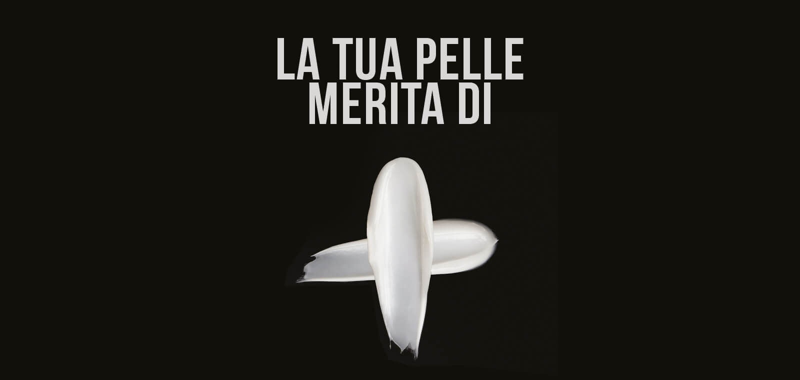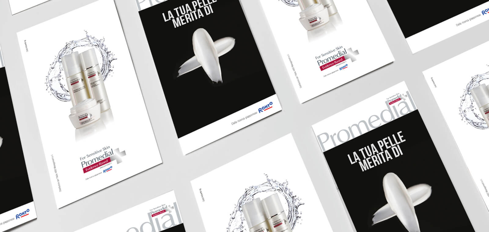
Our challenge, a truly stimulating and exciting one, was to communicate a Japanese brand, part of the very famous Rhoto pharmaceutical company. Dolci developed a strong concept, an immediately recognisable graphic symbol that would communicate a message all by itself.
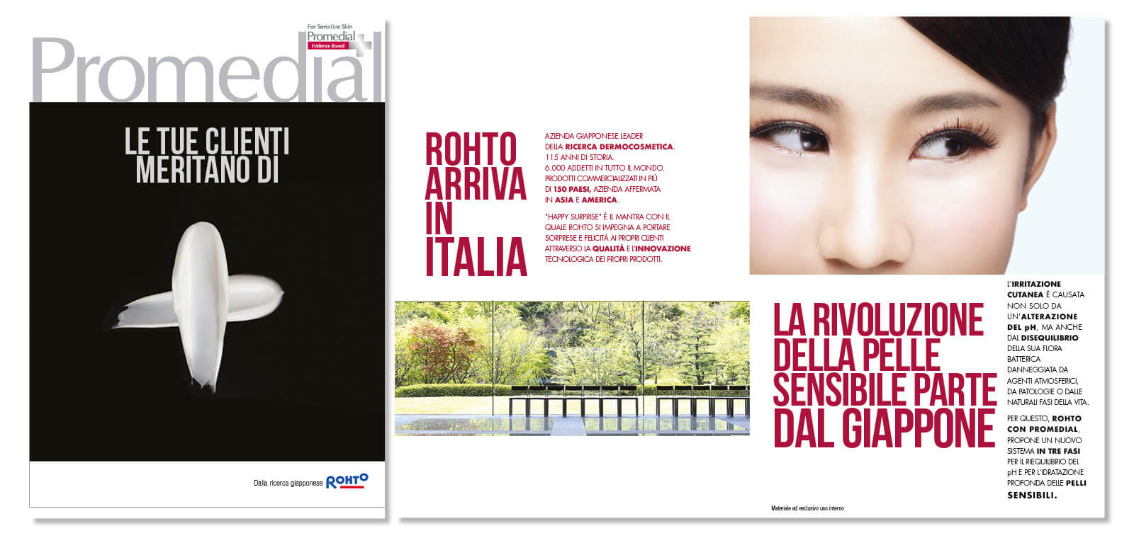
The trade communication took advantage of the extraordinary versatility of the advertising concept. In materials for pharmacies and promotional kits, the “+” sign became a formidable icon, and a loyal ally for the pharmacist.
The agency carried out comprehensive branding work: from the logo to the website. We also created folders for dermatologists and pharmacists and numerous press adverts in some of the major pharmaceutical magazines.
Your skin deserves more
Client
Promedial
Credits
Photographer – Fotostudio Perazzoli